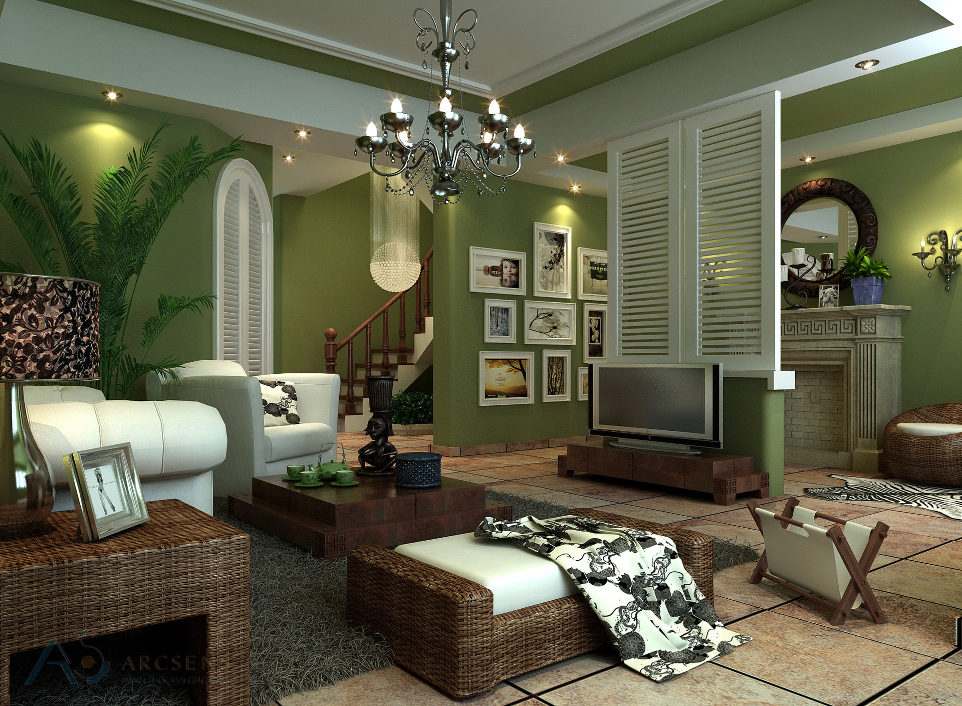
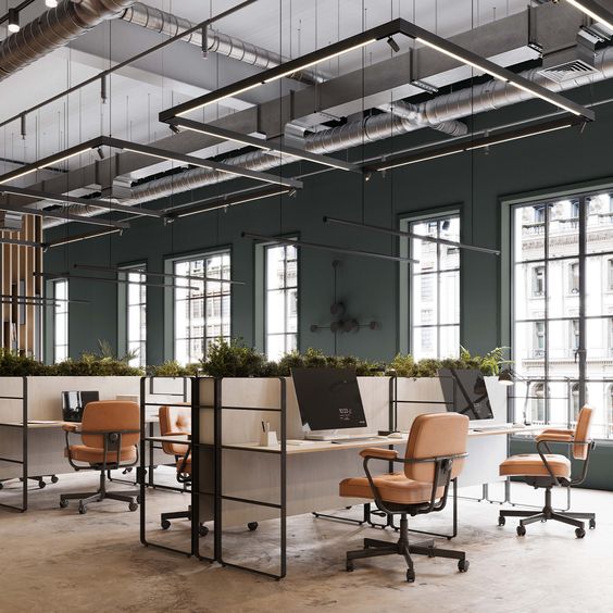
Never put furniture against the wall that had to be at least 30 cm, it helps the living room nice and airy, easy to clean instead of creating a dead corner contains more debris.
1. Back-ventilated room
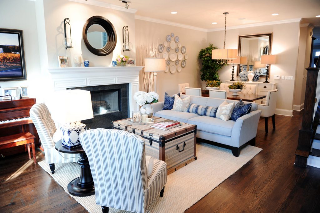
Make sure you get the open space when entering the room , particularly in the area of reception desk. To do this need to arrange furniture with reasonable room area. Mistakes that many families or suffered that is too much furniture and size mismatch, leading to difficulty walking, pressing the chamber.
2. Do not forget rule one meter
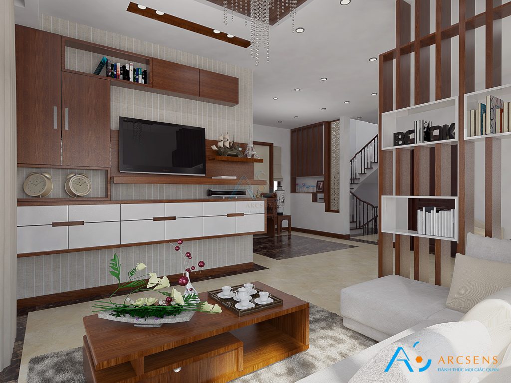
You should have a meter gap between the furniture in the room to move around conveniently, without being encumbered furniture or walls. On the main thoroughfare, this gap may be wider.With road traffic side, you arranged narrower, 80cm size also. In addition, the furniture has drawers, door opening / closing must apply this principle to clear space for them.
3. Statistics sofa against the wall
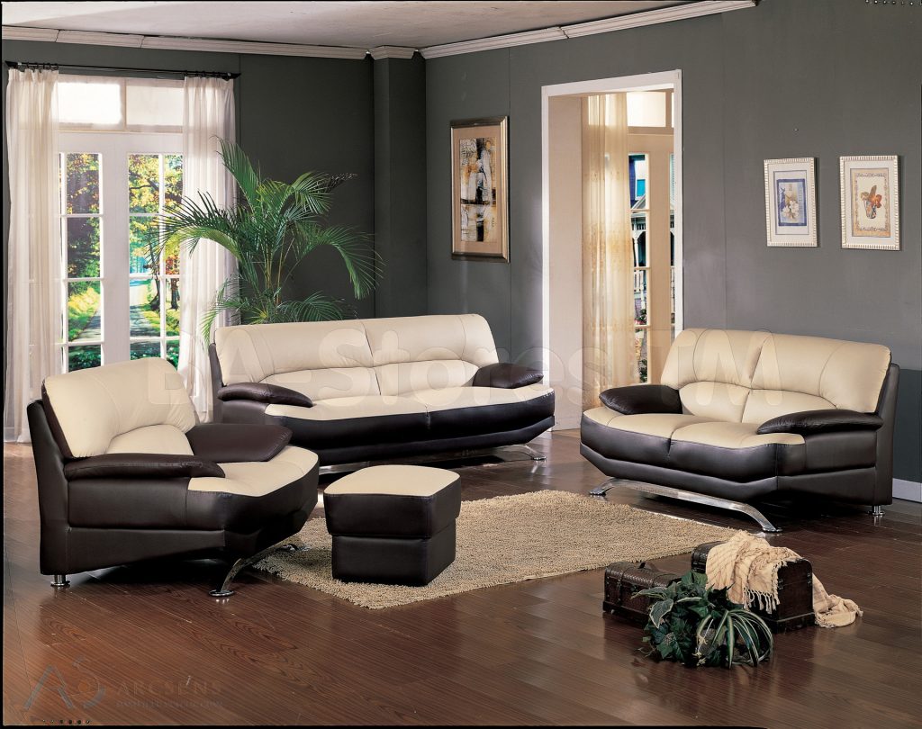
Do not push all the furniture in the room against the wall, so wrong. Bookcase, shoe racks, TV to the wall but could not get the sofa at least 30 cm wall (Figure). It will help space living roombecomes an airy, clean, fresh, warm, instead of creating a dead corner in your room.
4. Note to carpet
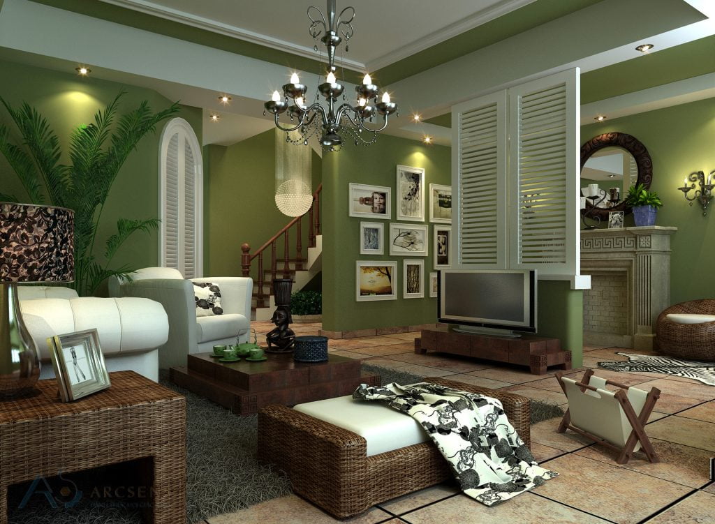
There are two ways to use the carpet in the living room, the whole room, or as the tea sector.Absolutely do not use the wrong size carpet, causing half the seats on the carpet, the other half outside the carpet (as shown). On the advice of experts designed it should be used only in areas carpet reception desk, just to create focal points in the room, just to help the remaining open space, more comfortable travel.
5. Consider lighting system
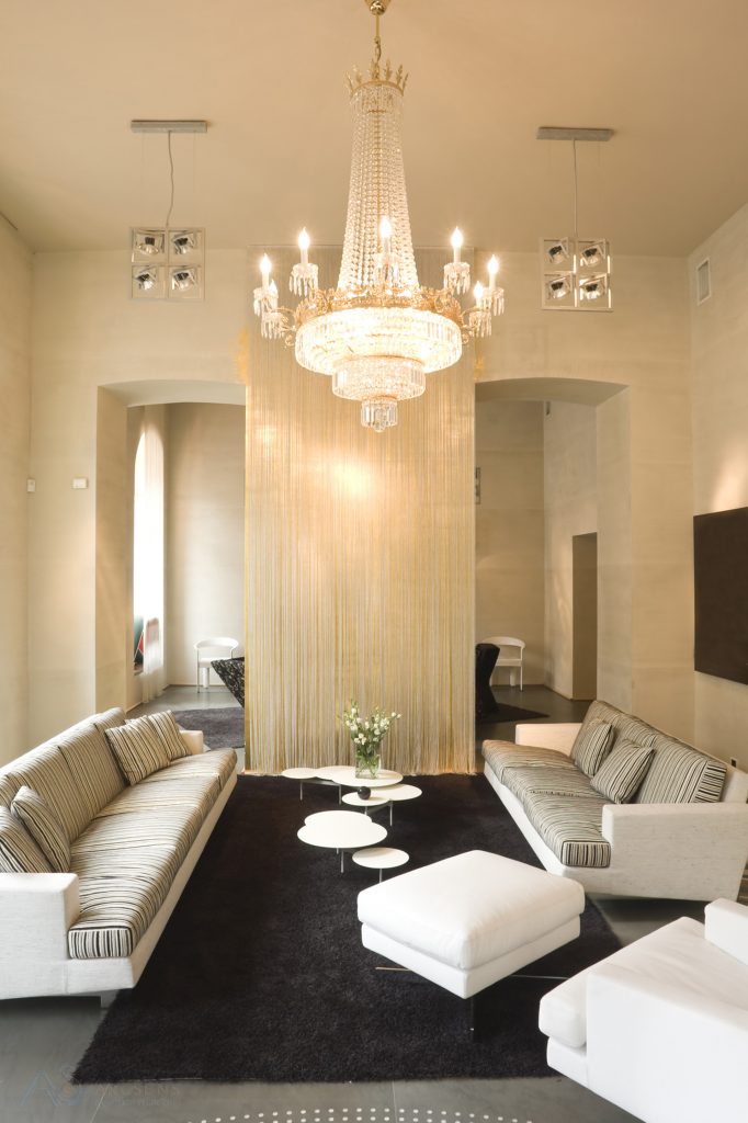
Both ceiling lights lighting equipment, to decorate the living room. Many families often buy too showy lights, style, size does not fit with the overall room. Ceiling lights too bulky can makeroom became heavy (pictured), as being lower ceilings. So only use ceiling lamp with simple design to be effective.
6. Paint Color mismatch
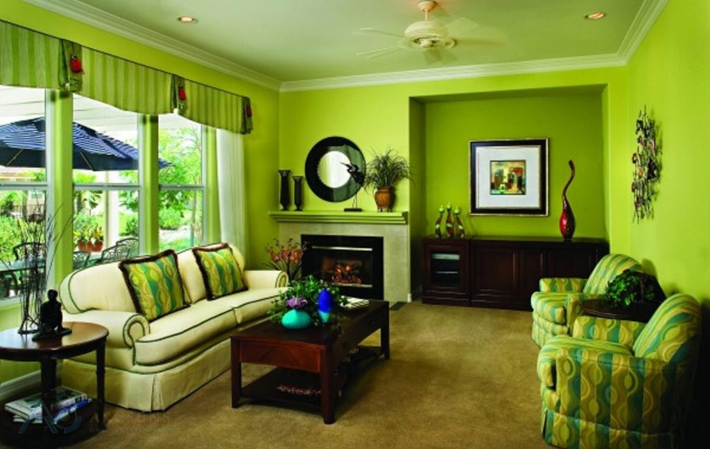
Wall paint color decision means beauty parlor. Choosing paint improperly can ruin the beauty of the architecture, furniture. Most secret department also makes the living room, uncomfortable.
Additionally, you should according to the choices of furniture that color, or vice versa. Not required furniture and painted the same color (as shown), by this arrangement was not carrying any aesthetic value, making the room even oppressed, suffocated.
Wish you have a living room very aesthetic and exquisite
SEE MORE:
Born with a mission: “Lay up senses – Enhance live Vietnam”
Sensory Architecture – ArcSens always work closely with you on the journey to build your dream home. By applying the most advanced technology in the design process, we are proud to bring the product architecture and the best service, exceeding your expectations.

